It's hard to boil down language. We've got a pretty complex set of mouth noises to communicate how we feel, what we want, what we don't want. The human lexicon is so vast and so intricate, we should never be at a loss in getting our point across.
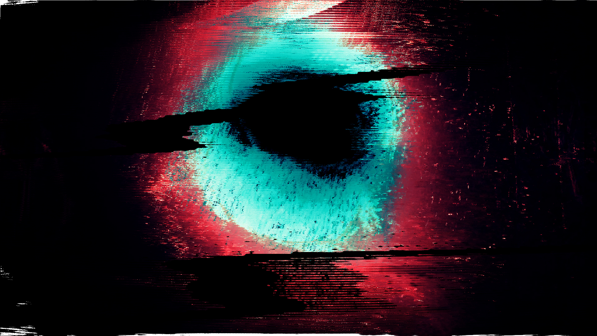
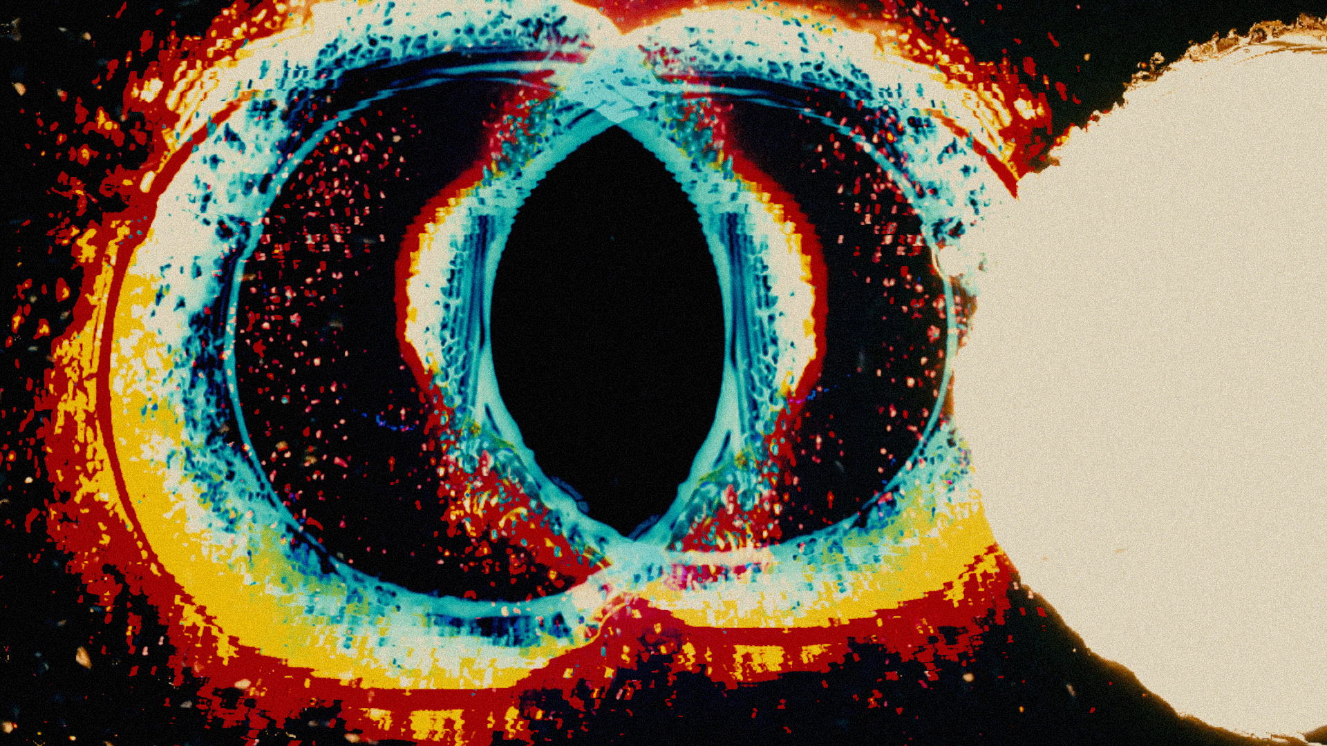
I find, though, that language is useless if barely anyone is listening. We do way less listening than we should. Why? Because everyone's fuckin' talking! Ever been in a conversation where the other person is posing as a listener and just waiting for their turn to talk? I mean...what's the point of formulating an intelligent, understandable and respectful idea into words if the other person is just waiting to talk right back to you? They're actually internally talking to themselves while you're talking to them. This is why signals get crossed. When we communicate with each other on a mass scale, it would probably look something like this:
There are two definitions for the word crosstalk.
1. unwanted transfer of signals between communication channels.
2. casual conversation.
It really makes a ton of sense that, according to this definition, a conversation could be equated to an unwanted transfer of signals.
Another interesting analogy: When telephone systems were entirely analog, crosstalk happened pretty often. That meant that you heard several other callers on the same line yapping away along with various signals within the system. But an interesting part of this phenomenon is that the person you're calling wouldn't hear any of this interference. They'd hear you loud and clear without interruption as if you were alone with that person. Meanwhile you're hearing them as part of a crowd. Do I need to hammer home the metaphor there?
Here's an actual recording of what I mean. There is no editing or sound design done here. This is actual crosstalk from a landline from September of 1980.
-----------------------------------------------------------------------------------------------------------------------
Before I get into a little bit of how this was made, I have to thank a man named Evan Doorbell. I do not know this man, but I stumbled up on his YouTube clips with hours of analog bell system recordings. It's a treasure trove of real physical sounds made from the old bell system in the US. His recordings are mainly from New York and New Jersey. He narrates these audio recordings, is extremely knowledgeable about the semantics of all of these wonderful tones and what they mean and explains them in a pleasant way. So if you're into this kind of stuff, definitely check out his recordings on YouTube.
-----------------------------------------------------------------------------------------------------------------------
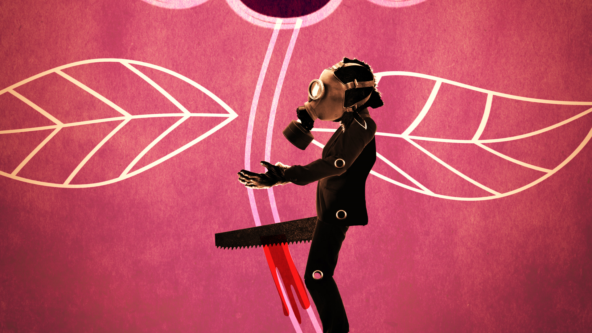
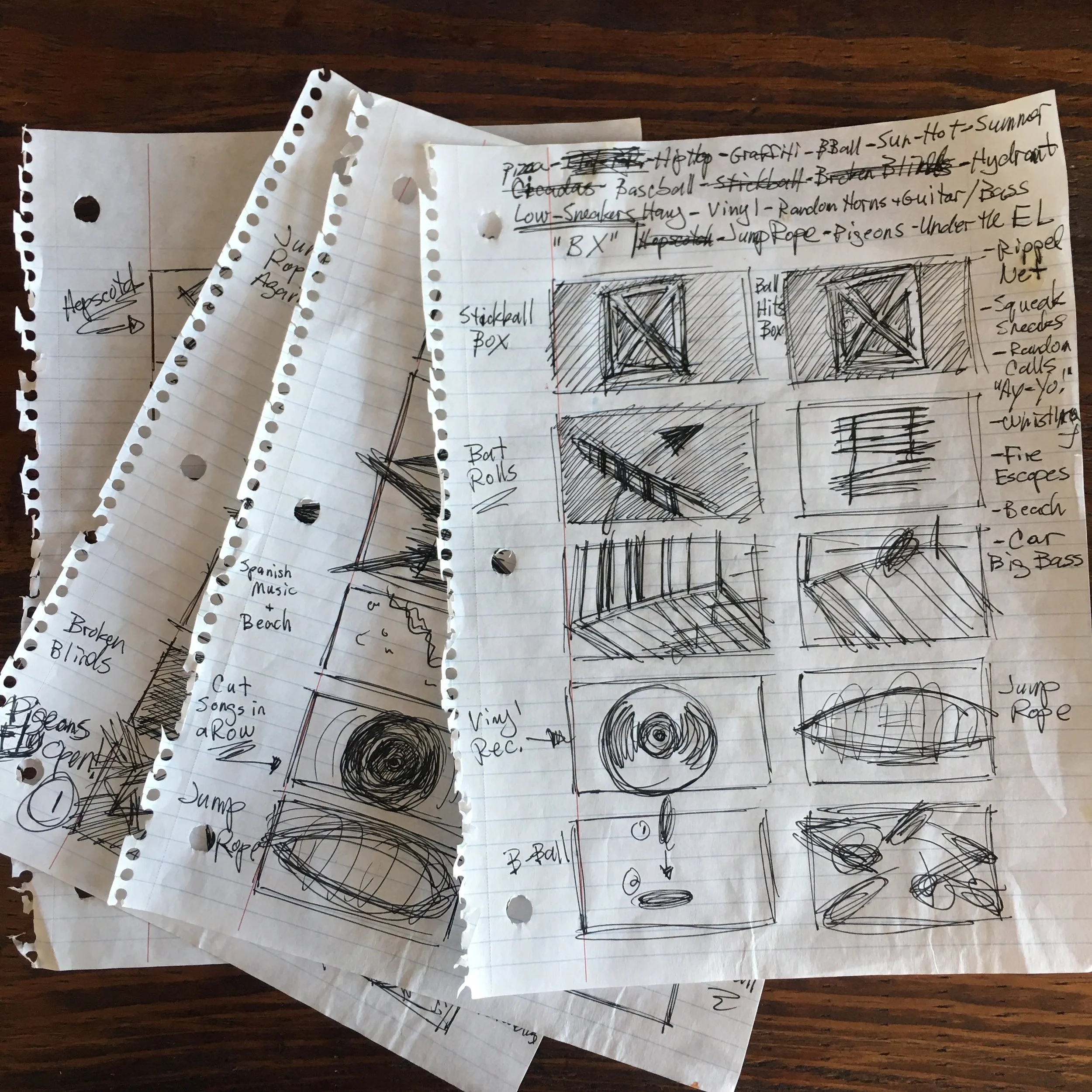
This film set a land speed record thus far. I started working on this the morning of it's release and finished it two hours before release. So about 12 hours in total, start to finish. I figure that's about as fast as I can complete these things while not producing a total piece of shit. Admittedly, this film is not one of my personal favorites, but I do like the prospect of pulling off a quickie in roughly 12 hours time.
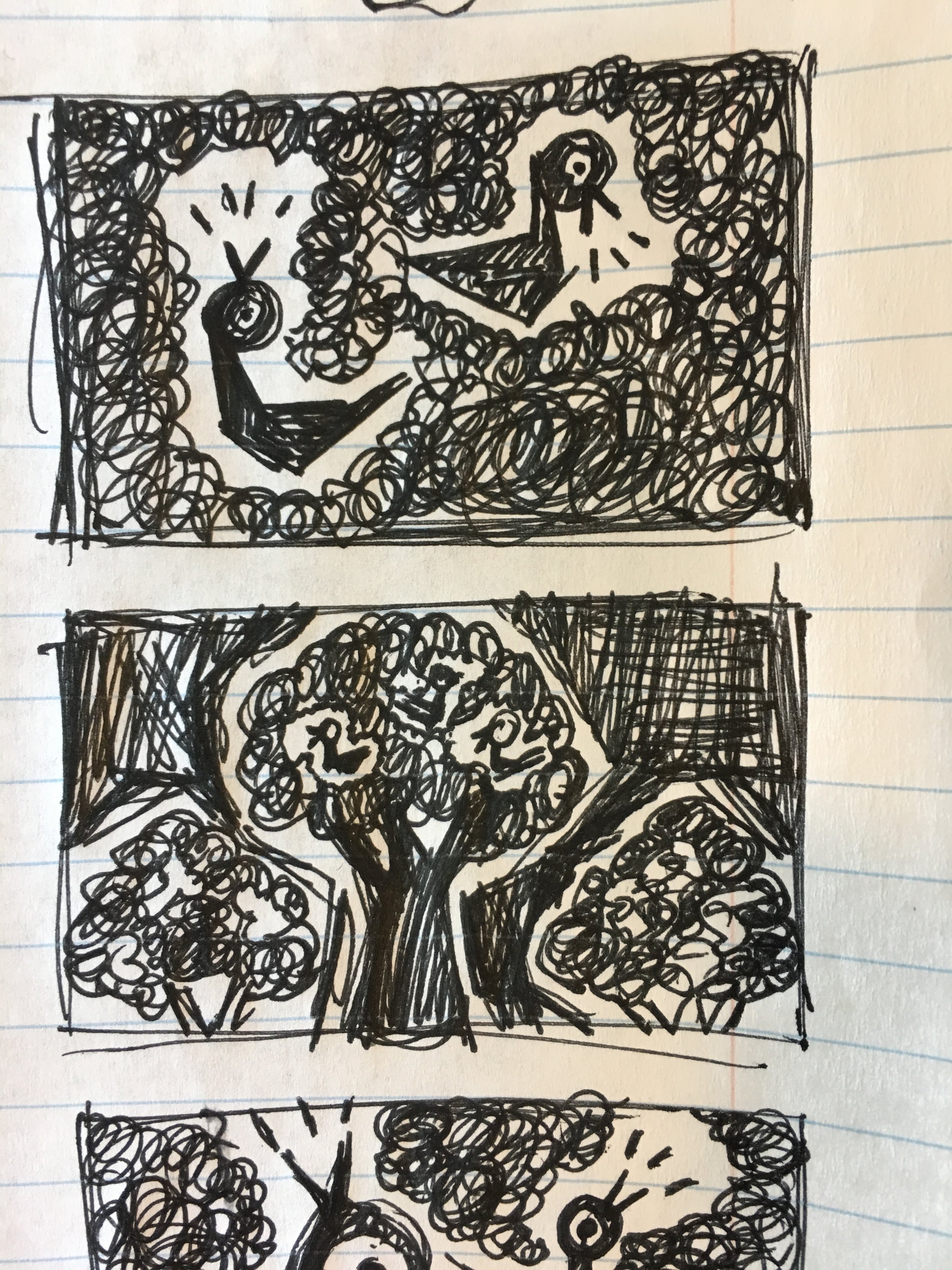
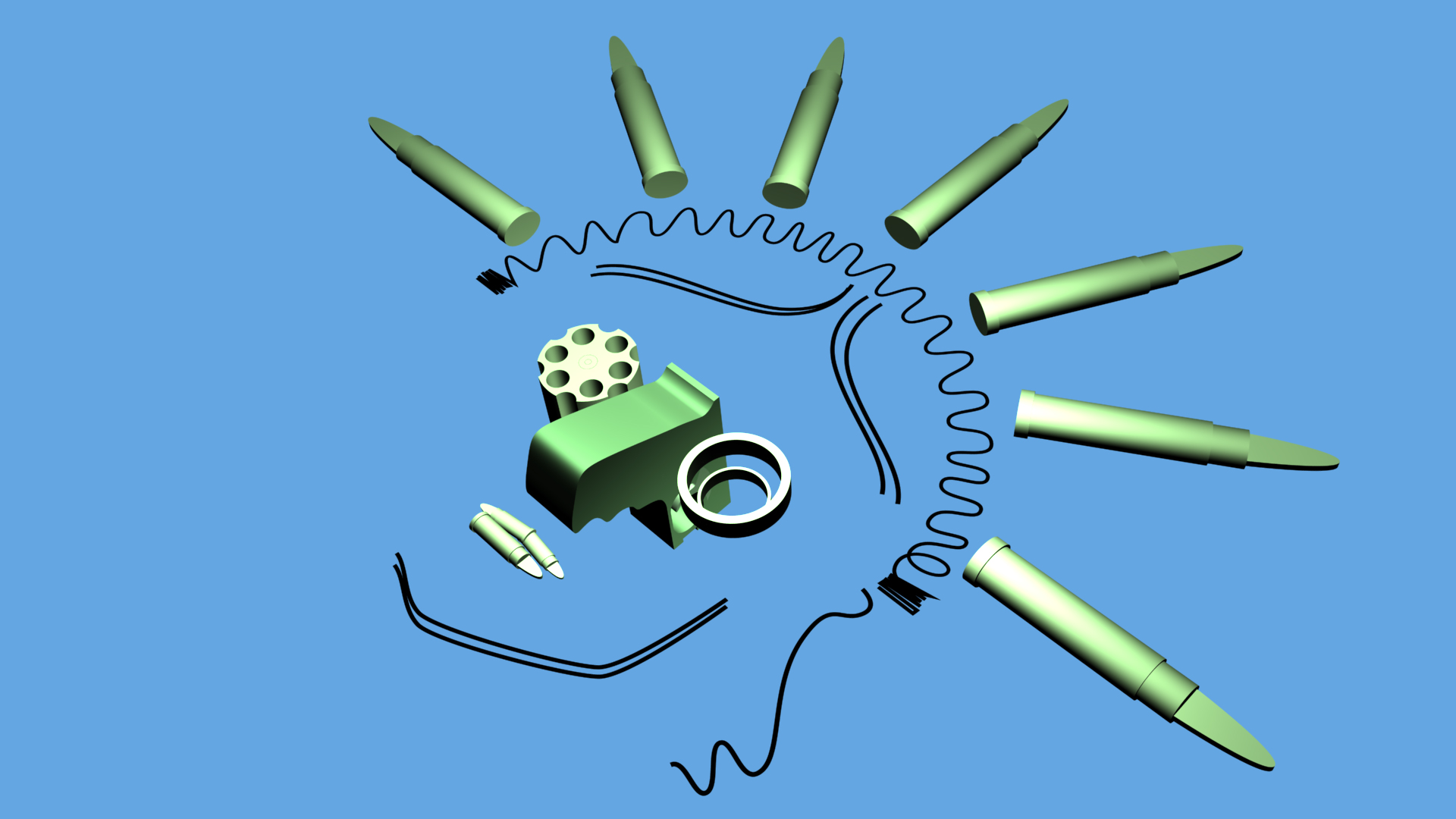
I borrowed footage of a string from another film I did and used it for the "lines of communication". I stole a bunch of skull X-rays from Google too. So between those two things and Evan Doorbell's recordings, not much is totally original here. Gotta do what you gotta do, I guess. I'm not always going to have 3-4 days to leisurely work on these.
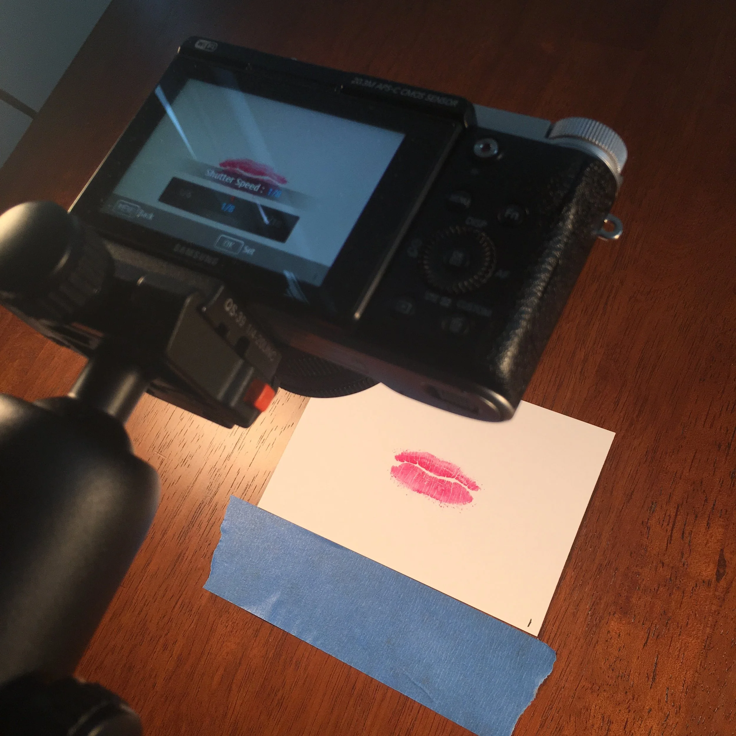
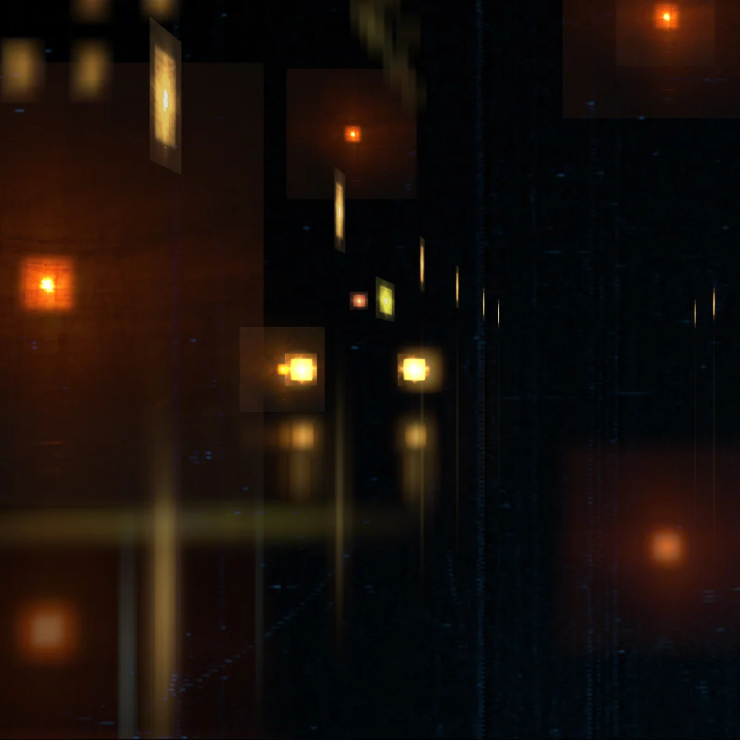
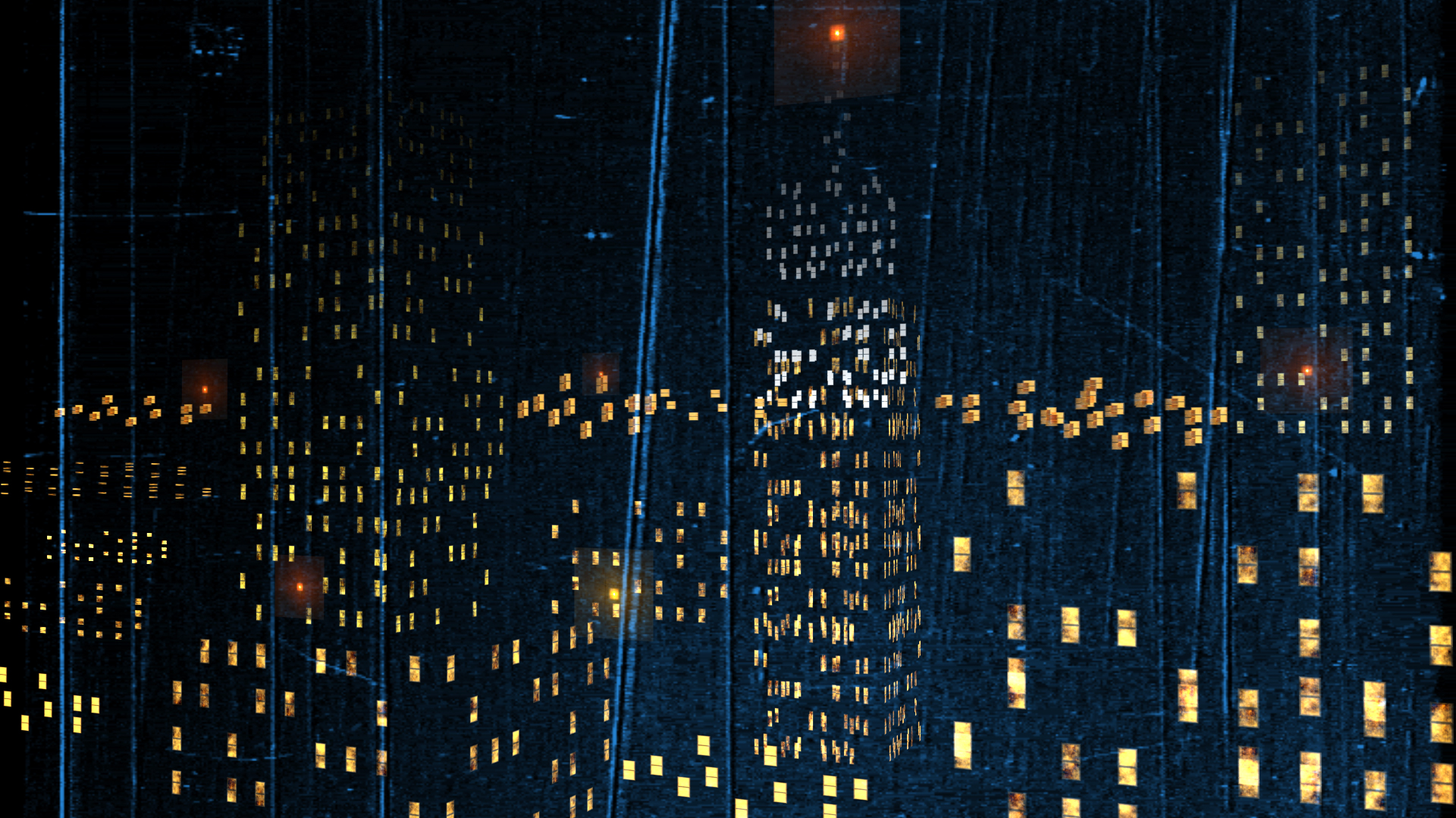
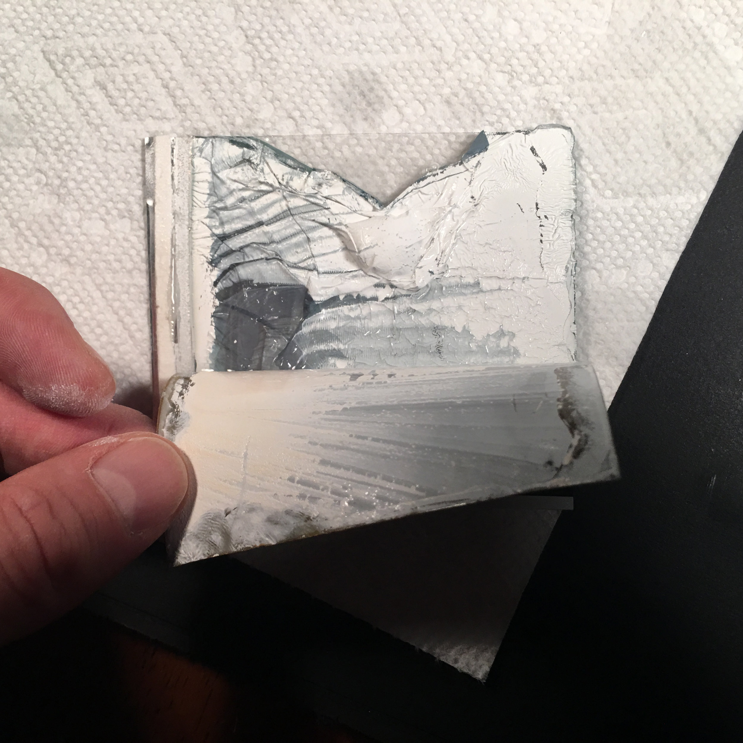
One point of interest was getting the translucent X-ray look. I didn't have time to mess around with filters in After Effects and I typically gravitate towards using real elements anyway so I achieved this look the best and fastest way I know. I played the film on a TV screen and filmed it:


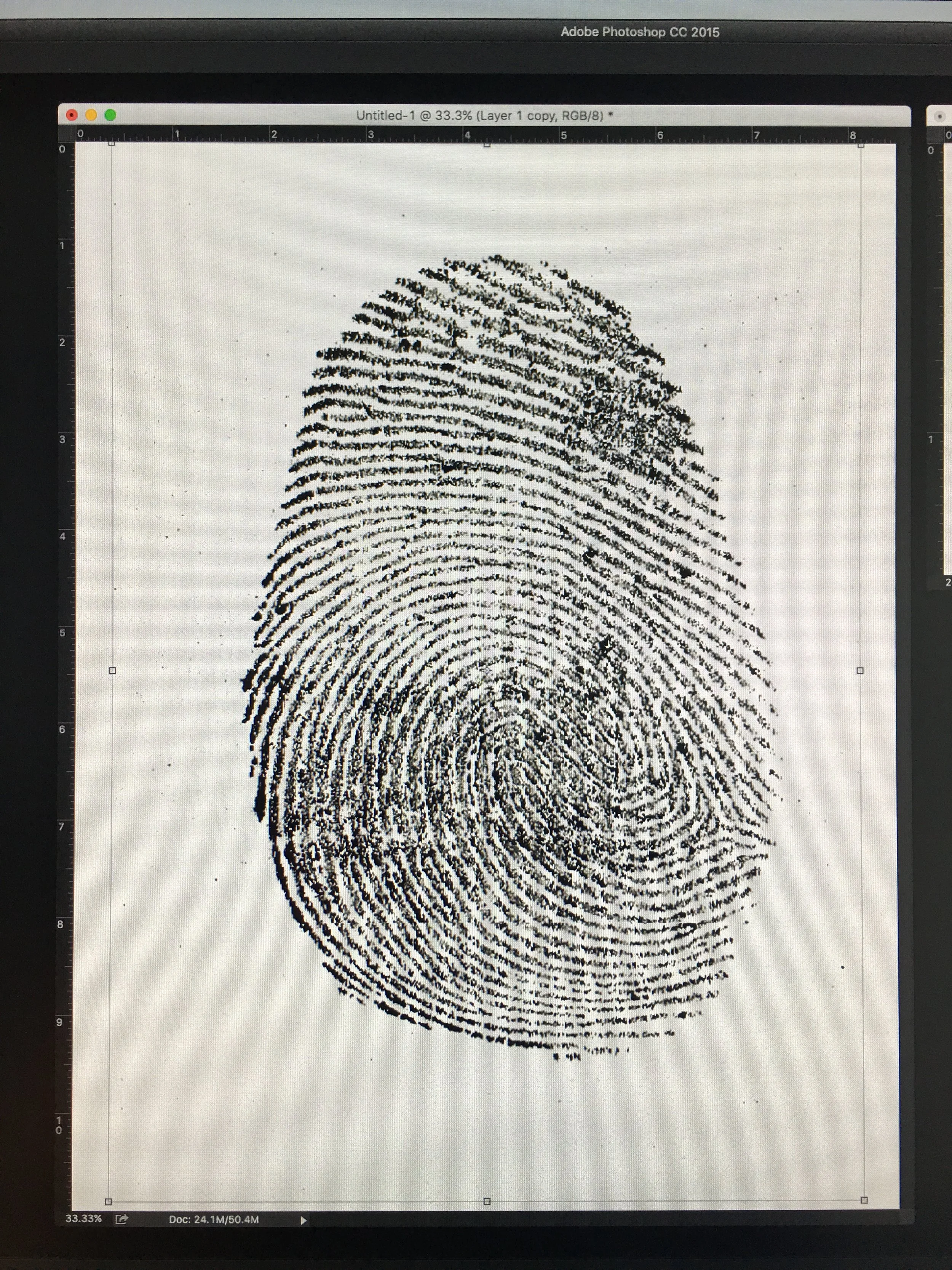
I also got up close and personal with some static clips I have laying around:


So, you're actually watching two takes of footage of my monitor playing the film that I then edited together along with a few shaky shots I took for transitions.
Thanks for reading!